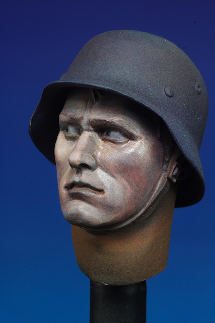
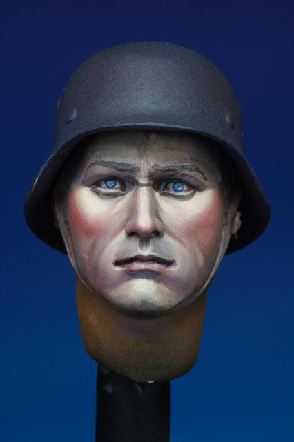
I've been fortunate this week to be granted some spare time to commence on another bust by Young Miniatures. Struck by the addictive fun of hearing the parts go "click" as they come together (a reminiscence of the Magnalock feature in Starcom toys from the 1980's), magnetic interfaces were implanted to all the adjoining components of the kit.
This has many convenient implications. For general spraying, the parts were attached to the side of a metal lid, allowing a safe distance away from the hand holding up the lid.
For detailed painting, parts were attached to a metal rod for greater flexibility and articulation.
The overall bust was given a ground color of Prussian Blue applied with an airbrush. This is followed by orange for the face and some random areas around the great coat. Instead of unloading the orange from the paint reservoir of the airbrush, Park Green and Pastel Blue was added to create a suitable tone for the great coat.
A light mist purple was sprayed to cut the chroma of the orange.
A small amount (not exceeding 20%) of acrylic paint retarder was mixed into the paints to increase their working time. This lengthens the time frame for more colors to incorporated via the wet on wet technique. Prolonged drying also prompts the paint to spread more evenly resulting in a smoother finish. However the pièce de résistance will be its intervention in breaking the surface tension of water, greatly enhancing paint flow and adherence, reducing traces of brush strokes and water marks.
The right of the face demonstrates the smooth results from two passes of the retarder added paint over the darker ground color. The left side shows the opaque coverage obtained with repeated passes.
The opaque build up of colors, tones and shades.
The retarder also causes a slow coagulation of the paint as it dries, giving it a buttery like consistency ideal for feathering.
Calvin


5 comments:
Excellent painting, Calvin!
Do you use blue and orange instead of black and white for the base painting recently? Is there any reason for that?
Hi Kazufumi,
the reason for using blue and orange is that it projects complimentary color contrast and chromatic luminance whereas the black and white combination has only monochromatic luminance.
Calvin
Thank you very much, Calvin,
This is really an interesting theory! I admire your passion and attitude that you always keep trying new style. I agree that blue and orange combination is better than black and white and I think it makes color control more rich. I will try it, too!
Thank you very much again and I'm a big fan of your works and always watching this blog! Keep it up!
Hello Calvin,
I know you must be busy, but can you give me a source for those magnets?
Thanks
Dennis
Hello Calvin,
I know you are busy, but can you give a source for those magnets?
Thanks
Dennis
Post a Comment