
Painting with Shades and Tints
Labels:
Modelling Tutorials,
Young Miniatures
A video tutorial on using shades and tints to render the great coat on this 1/10 scale bust from Young Miniatures.
Cheers,
Calvin
Calvin

In the words of Wilbur Smith "War is the game played by old men with the lives of the young". The pawn in this game is the combat soldier, represented by the miniature toy soldier; an insignificant being on the battlefield. Combat is the most intense moment of war, where life and death balances on a knife's edge. The results are terrifying and reveal the worst part of our human nature. Conversely, there are moments when it exudes the best of our human spirit. Most of the miniatures you see here are diligently researched from historical sources and handcrafted between scales of 1/35 to 1/16 (approx 50mm to 120mm). The intricate rendition of human expression and fine details not only demonstrates the level of craftsmanship but also serves as a reminder of the fragile nature of human life. I represent no political bias though my miniature creations. My aim is to portray humanity through the chronicles of military history and thus it is my pleasure that I present to you my weblog Perspectives in Miniature.


In conjunction with AK Interactive, this exclusive Gen 3 acrylic paint set is specially composed with the essential colours that I use to render WWII German Uniforms. It contains 18 colours and a small pamphlet with my personal colour mixes. If you are keen to acquire all the colours on my palette to paint a field grey tunic, a splinter pattern zeltbahn, an oak-leaf pattern smock or the Kharkov anorak, look no further, this is the set for you to get started.

Stop struggling with skin tones. Start painting them. I’ve spent years failing so you don’t have to. This set is the culmination of my experience as a figure painter, distilled into an easy, effective system. With 6 hand-picked 3Gen and Quick Gen colors and my personal technique booklet, you’ll bypass the frustration and go straight to stunning miniatures. Experience the difference and level up your skills today.

Do check out my Podcast interview with Barry Biediger and Jim DeRogatis at Box Dioramas.com

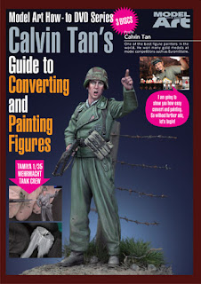
I developed this instructional DVD with Model Art magazine to help beginner armor and diorama modelers master the art of the 1/35 scale figure. In this video, I demonstrate easy-to-follow techniques for painting injection-molded plastics—from choosing the right brushes to the 'little tricks' I use for fine details. This is a complete showcase of my personal methods, and I’m confident it will help any modeler take their work to the next level. For your convenience, the DVD is available in both English and Japanese."

This video presentation documents the process of rendering a highly detailed 1/35 scale after-market resin figure. Watch as I take the viewer through the process of rendering of leather, uniform insignia as well as camouflage patterns using the techniques and materials presented in the beginner's guide to achieve convincing results. It is available in both Japanese and English.
In this third instalment, I will share my techniques and materials to customize and detail an inexpensive stock plastic figure. Watch as I take you through the steps on how I modify a pose, model details such as hands, belts and webbing and insignias. Learn about working effectively with epoxy putty as well as plastic styrene and paper. As a continuation from my first two DVDs, I will demonstrate how to model and paint a simple groundwork as well as an alternate approach using a monochromatic underpainting to render both a field grey tunic and the World War 2 German Splinter Camouflage pattern on a helmet cover. If you have enjoyed and benefitted from those previous titles, this edition will be a welcome addition to your journey in scale figure modelling – regardless of your current skill level. It is my sincere hope that this could inspire you to embark on your own creative adventure in this fantastic hobby.


A video tutorial on using shades and tints to render the great coat on this 1/10 scale bust from Young Miniatures.


