.
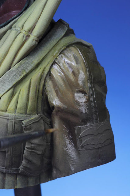
The project gets more headway as the aluminum parts are hand painted from silver paint extracted from Tamiya silver paint marker. Preliminary highlights and shadows are rendered for the right arm and the kapok vest.


Attaining value contrast has generally been my preference towards painting the smaller scale figures. Working on a larger 1/9 scale allows more latitude to introduce a wider range of colors due to the increased surface area which would otherwise be limited on a 1/35 scale figure. There are many rationals to this application - of which elemental effects such dirt, stains, etc... seems to be widely practiced. However, the full effects of lighting and shadows are often left unexplored. The convenient color choice of highlights and shadows is based on its value against the local color. If the local color is green, the colors of the highlights and shadow will be respectively that of light green and dark green. This is the most straightforward approach to yield contrast. However, because this mode of painting does not represent the true nature of light -in spite of the fine rendering - the result appears stark and artificial.
It is imperative to know that shadows do not imply an absence of light but just a lack of it (as more clearly explained in this
article). It is a different quality of light produced by the intensity and source of the illumination. I reflected this different quality with a subtle glaze of blue-green into the deepest shadows of the figure instead of the stark raw umber or black wash.
The following pictures reveal the unflattering breakdown of the kit's components and how the incorporation of magnetic interfaces assist in the painting and alignment of the individual parts.
The right arm is painted separately so as to facilitate the painting of the intricately sculpted zipper, seams and rank patch.
The flying helmet was depicted in red brown leather -rather than the commonly seen canvas variant - according to Mike Good's wishes. And I have to agree that it does lend a nice contrast to the predominantly yellow scheme.
The highlights to the kapok vest was glazed on with a mix of Light Yellow and Naples Yellow.
Stronger highlights were established with repeated glazes of Light Yellow and Naples Yellow.
The lower regions - distant from the overhead light source - were glazed with an light olive color mixed from Light Yellow, Cadmium Orange and Hookers Green.
The deep recesses were lined in with a mix of Earth Brown, Carbon Black and Hookers Green.
Finally, a light wash mixture of black, yellow and blue was applied to simulate shadows on the aluminum areas.
In the next posting I will reveal a little secret technique I discovered for making the inscriptions on the parachute buckle.
Calvin


